Too many browser tabs opened? & it is harder to manage them? Try my Browser Extension.

Three Important Approaches to Web Design
From flat design to particle backgrounds and broken grids, web design is a creature in constant evolution. And, since 94% of users will leave a site that looks decrepit and possibly defunct, keeping abreast of the latest trends is undoubtedly worthwhile.
But the purpose of a site in any type of funnel is still to connect users with a business through positive experiences and discoveries. To help you stay grounded as you work towards attaining the perfect site, we’ve highlighted some of the key approaches to good design.
Adaptive Design
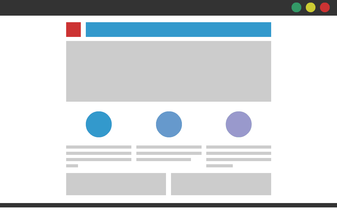
This approach is probably the bare minimum requirement when it comes to flexibility on any website. It requires a lot of work since implementation basically means designing the site for around six differently-sized device screens. The best way to describe an adaptive website is it employs “snap” design. There are specific breakpoints at which the website snaps to a predetermined size.
Responsive Design
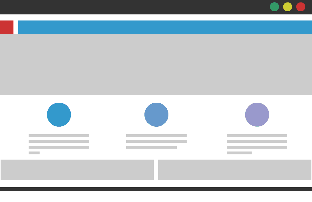
Responsive design is basically a level up from adaptive design. It’s much harder to build but makes for smoother user experience. The approach allows the site to shrink or expand fluidly. (No breakpoints and fewer snap adjustments.) In order for a site to be considered truly responsive, grids have to be fluid and all other elements flexible, so they scale to the right size.
Inclusive Design
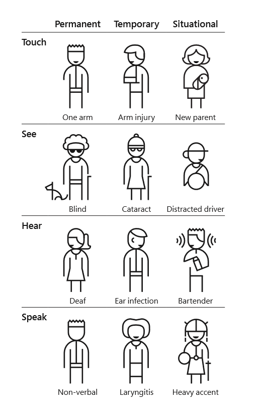
This isn’t exactly a technical approach to design aesthetics or usability, but we’re touching on it anyway since, from a business perspective, any form of exclusion narrows down your target audience. That’s certainly not a smart move when it comes to lead or revenue generation. More importantly, designing for inclusion is something we should adapt just because it’s the right thing to do.
The term “inclusive design” is often used interchangeably with accessibility since both approaches aim to make a website easier to use for a variety of users. Inclusive design, however, does not necessarily focus on making a site friendly to people with handicaps. It seeks to eliminate barriers for all users. FastCompany summarizes it well: “Accessibility is an attribute, while inclusive design is a method.” And when DesignAdvisor cites that 75% of users judge a company based on their site’s design, who would want to be perceived as non-inclusive?
Bonus point: posting frequency
Finally, while not strictly design-related, the rate at which you post can have a profound effect on the way visitors perceive your site. With inboxes flooded by post notifications and mobile phones constantly pinging alerts, take the time to evaluate whether or not your posting frequency is merely adding to the mind-numbing noise. While it is true that keeping things fresh matters and search engines love it, long-form, high-quality content has been proven over and over as the preferred resource for search engine queries. This has been holding true for both desktop and mobile searches.
In fact, Jay Baer of Convince & Convert openly admits that at one point, the high content frequency was a result of the lack of a solid content strategy. Take stock. Is it possible that you’re compensating for quality with quantity? It’s okay to scale back and maintain focus on long-form quality content. Observing the data over time, you’ll be able to find the frequency sweet spot. In the meantime, though, the impact should take a higher priority since it brings actual value to users.